2025 Case Study
Increasing referrals by 10% for Upside
Design / Research / User Testing
About the project
The referral program at Upside hadn’t changed since its inception 9 years prior. Yet, 25-30% of new conversions join Upside through the referral program.
As a Phase 0 to improving their overall referral program, we needed to redesign the referral experience, creating room for the program to evolve.
My partners
1 User Researcher 🕵️♀️
1 Product manager 🤹♂️
4 Engineers 👨💻 👩💻 👨💻 👩💻
1 Data analytics specialist 🧑🔬
1 Designer ✋
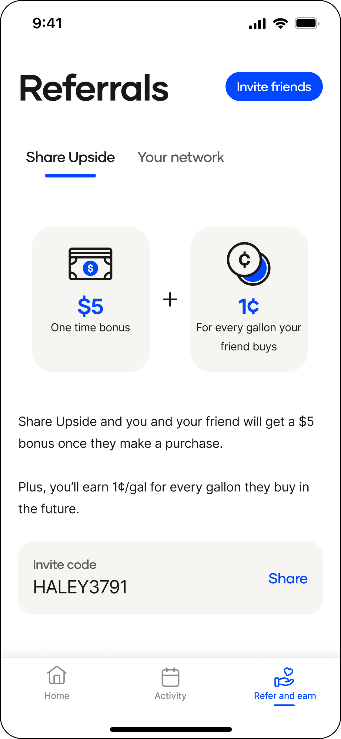
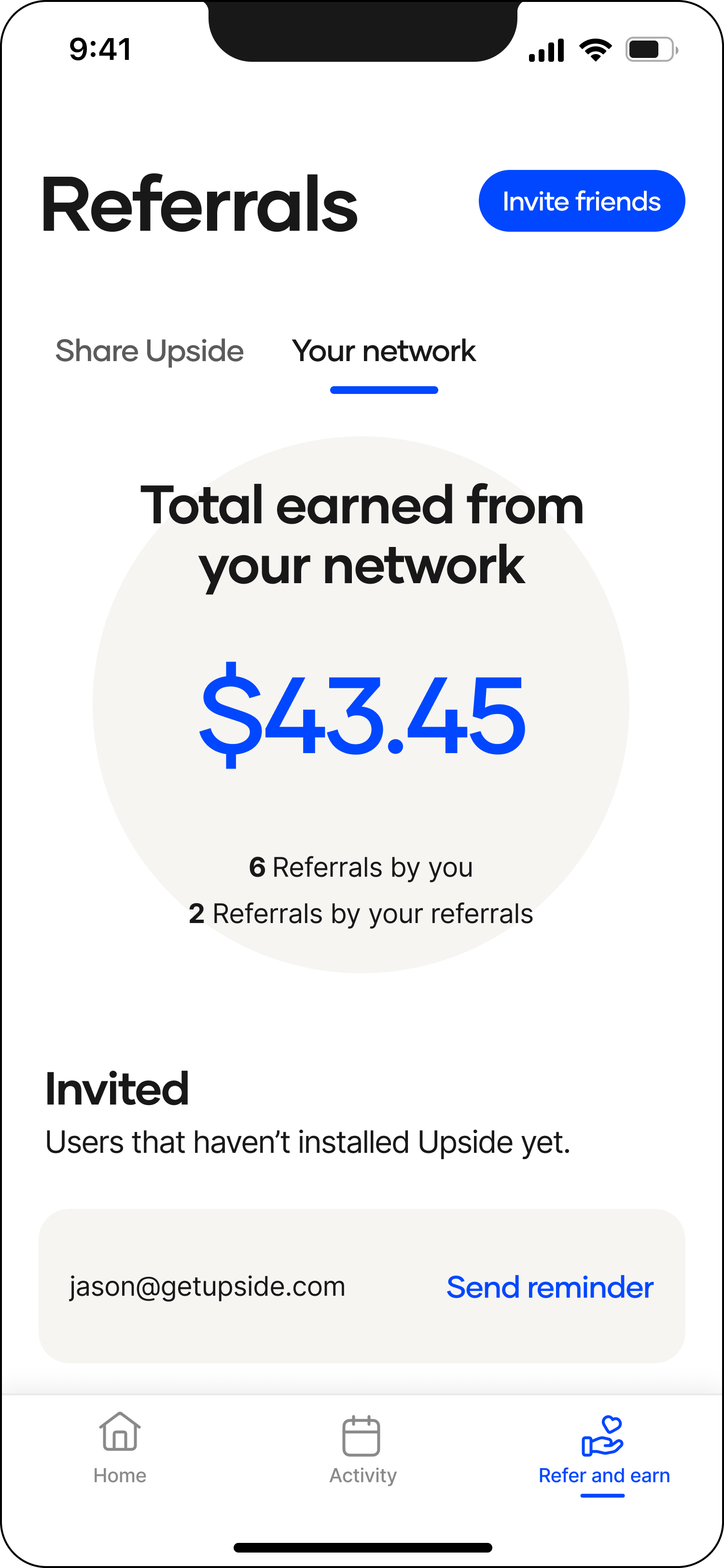
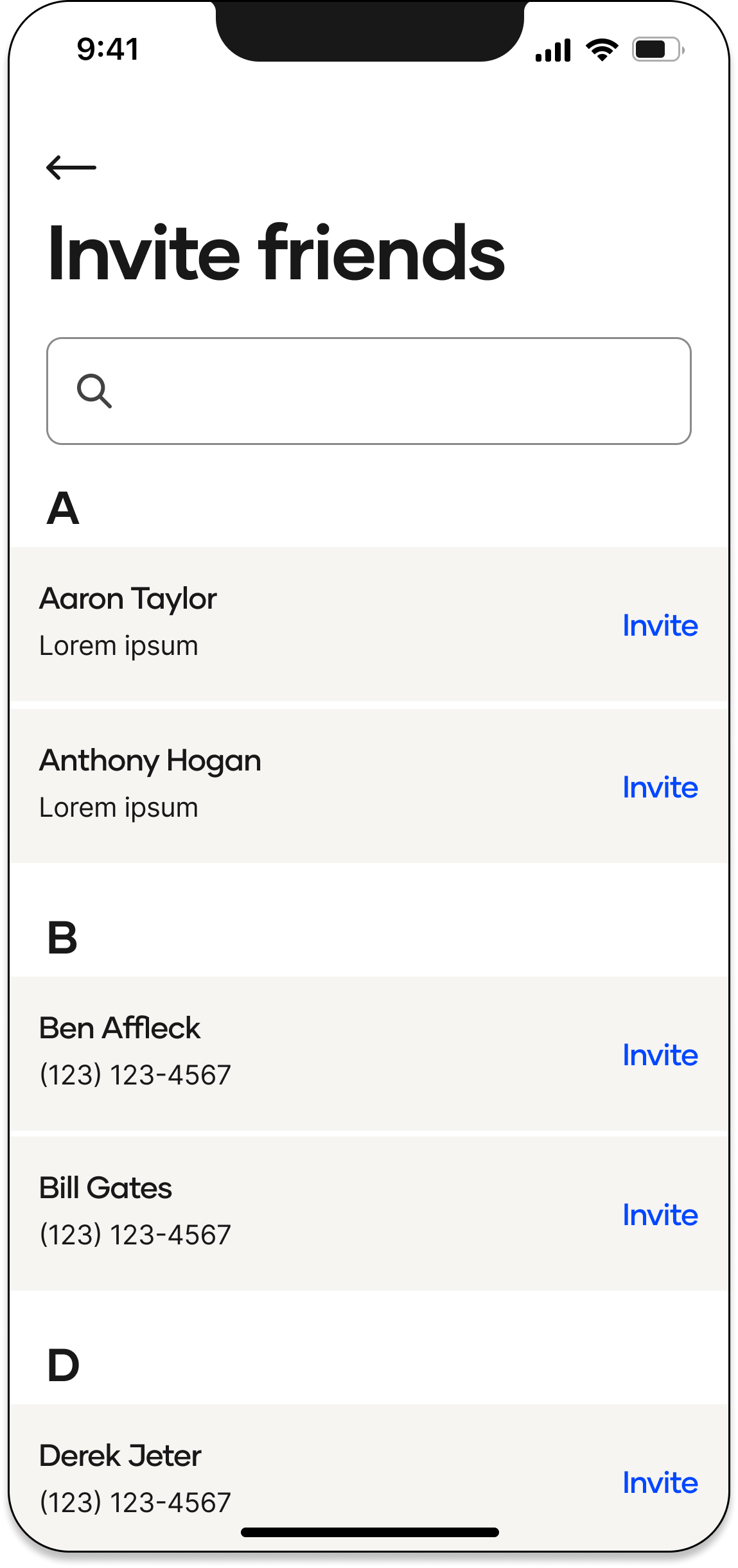
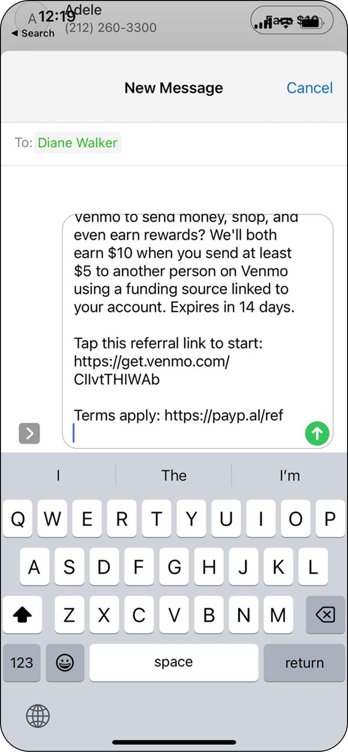
What did the referral screens look like before this project?
Share tab
Your Network tab
Invite friends screen
Sending invite via text
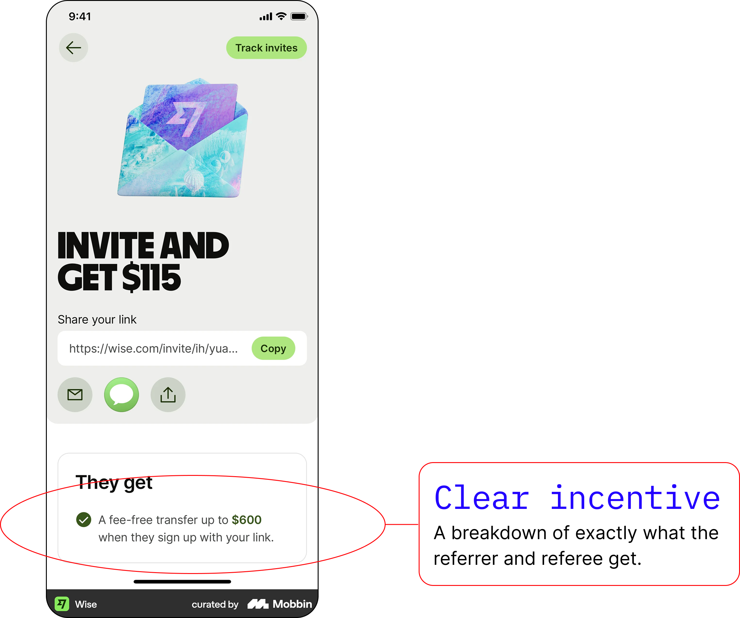
Competitor analysis
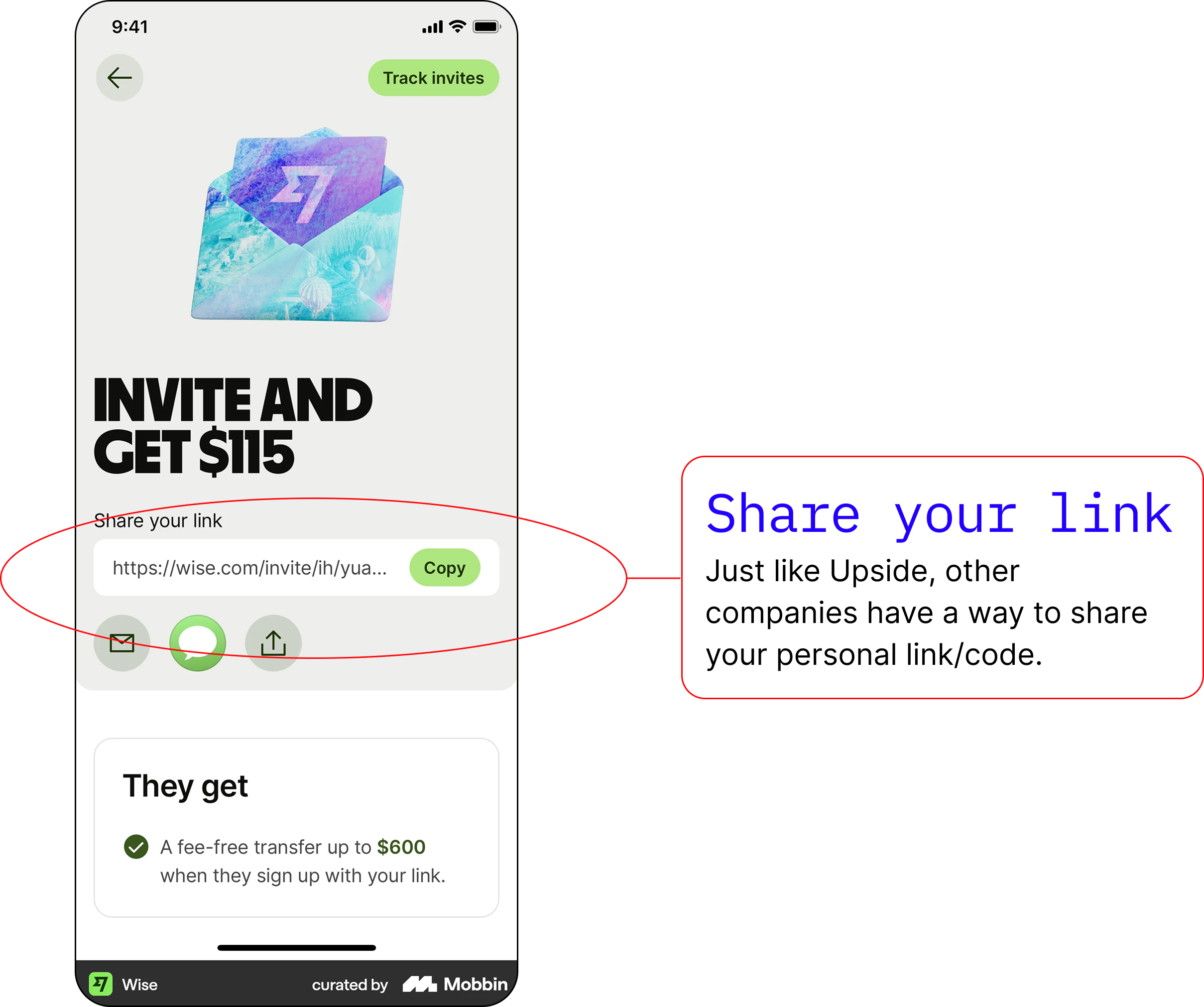
First we looked at how other companies were handling referrals.
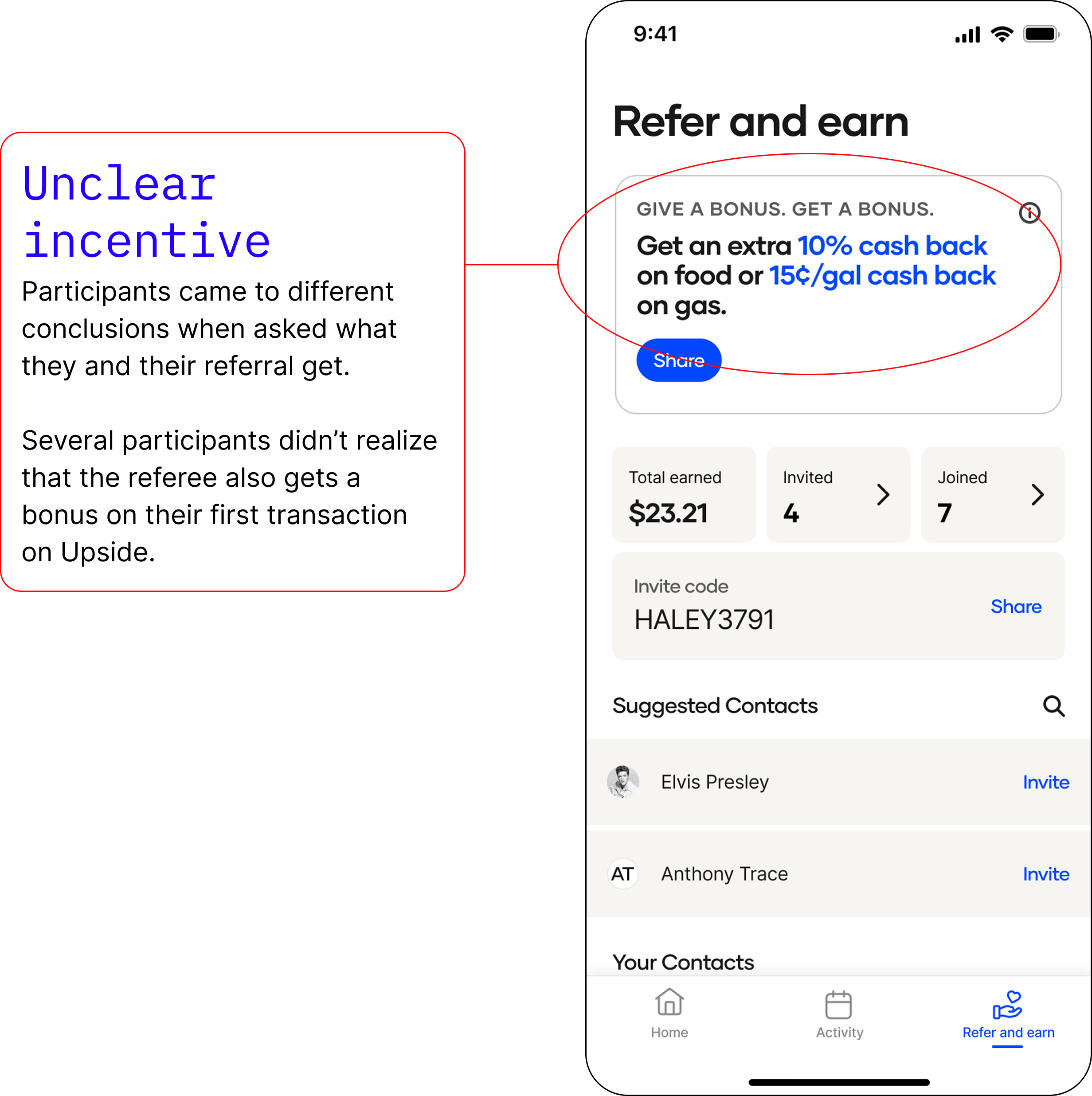
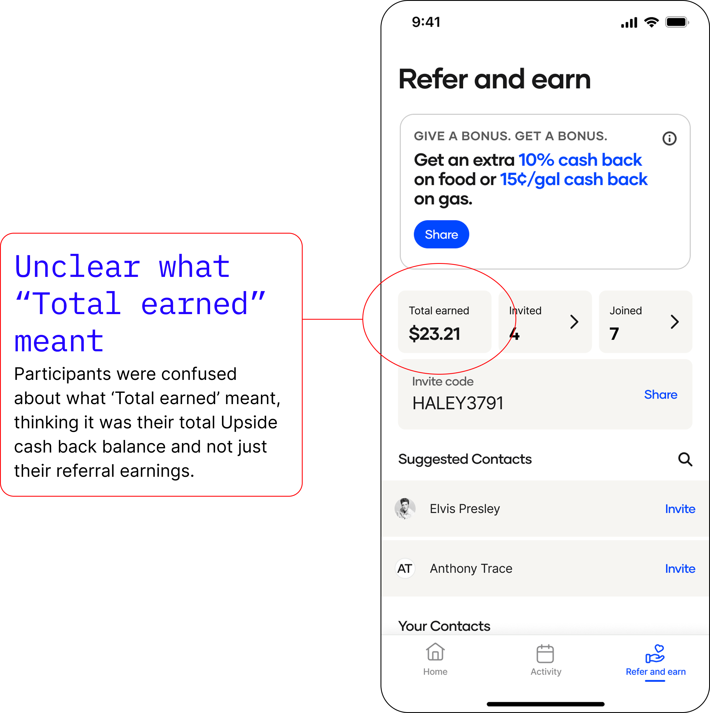
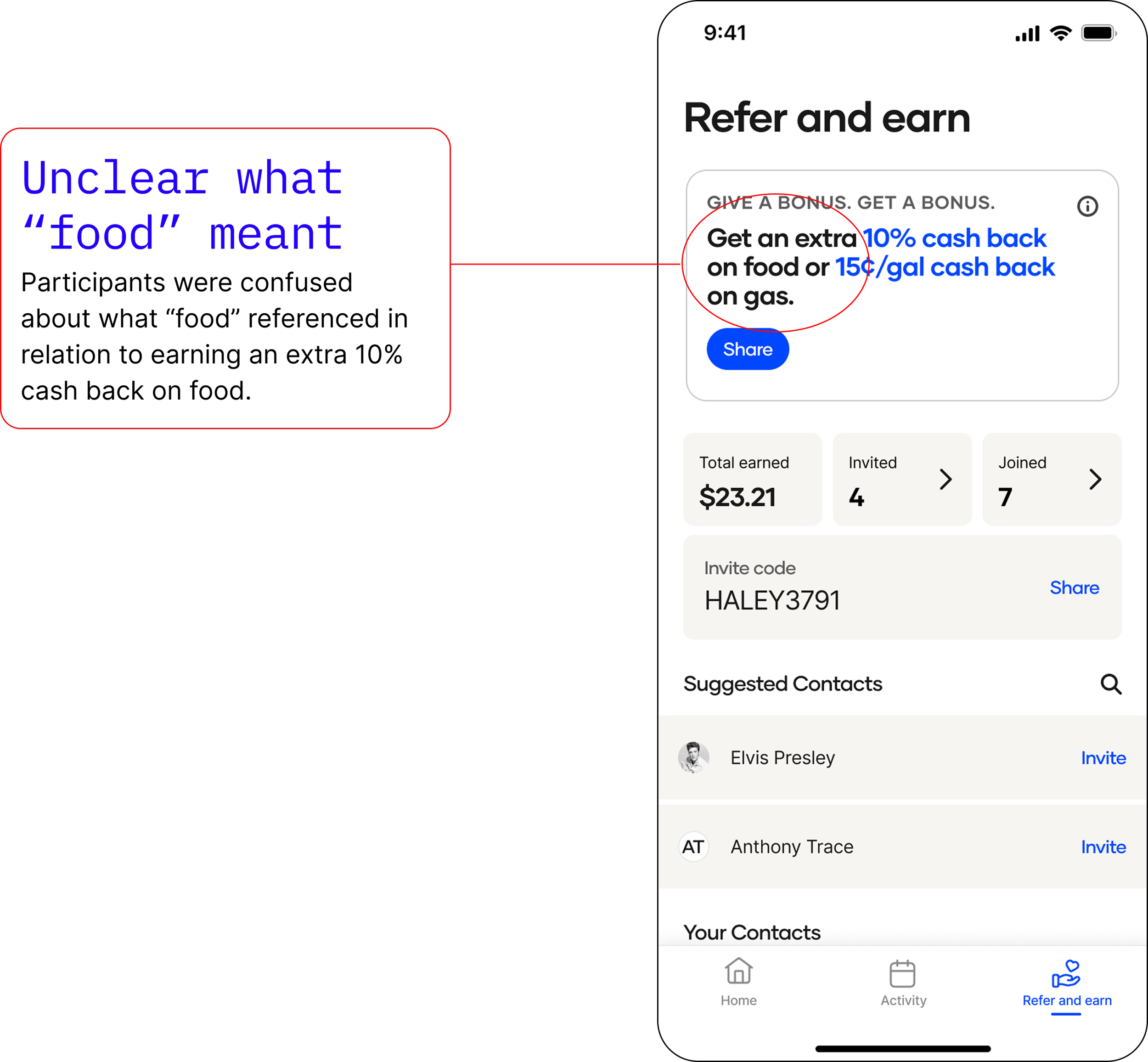
User testing results
We identified a lot of pain points that needed to be addressed.
Continuing to iterate
Not only did we identify issues in the design, I also was feeling very uninspired by the look and feel of the design.
For a very human feature, referring friends and family, the design had no life to it. I wanted to fix this.
Concept 2
Addressing user testing issues and improving the overall design to feel more lively and exciting.
User testing results, part 2
We learned in our second round of testing that all pain points were successfully addressed. We were ready to work on finishing touches.
Voting on photography
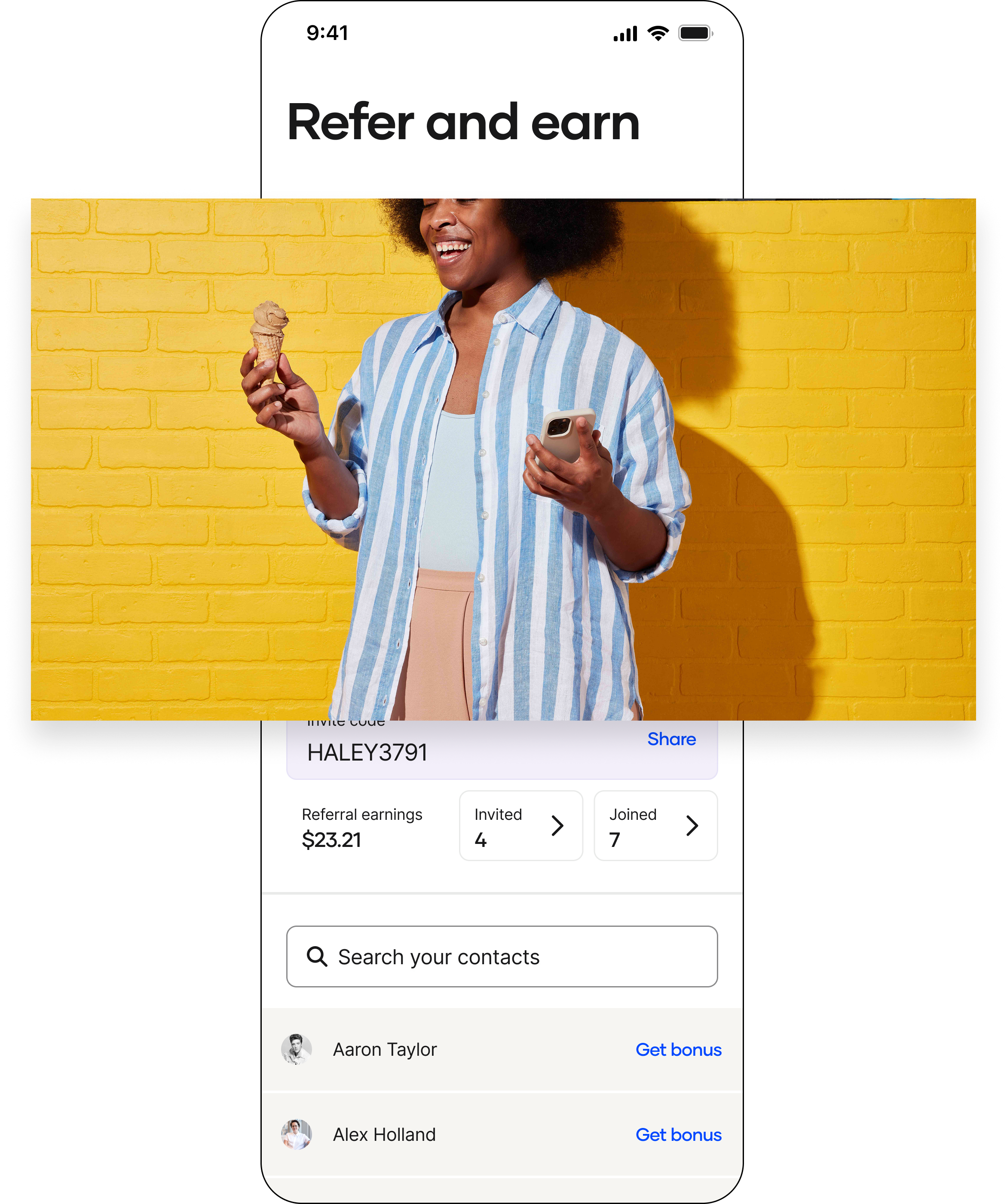
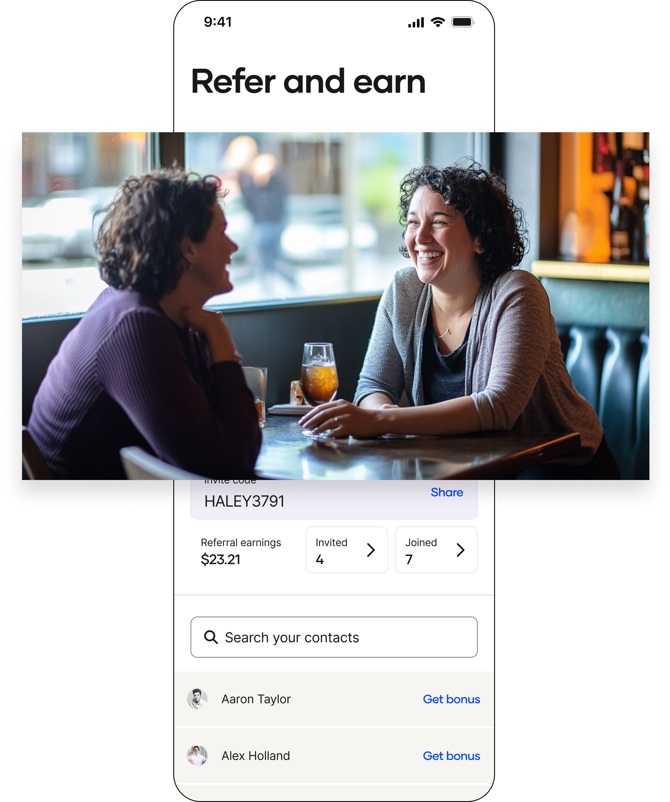
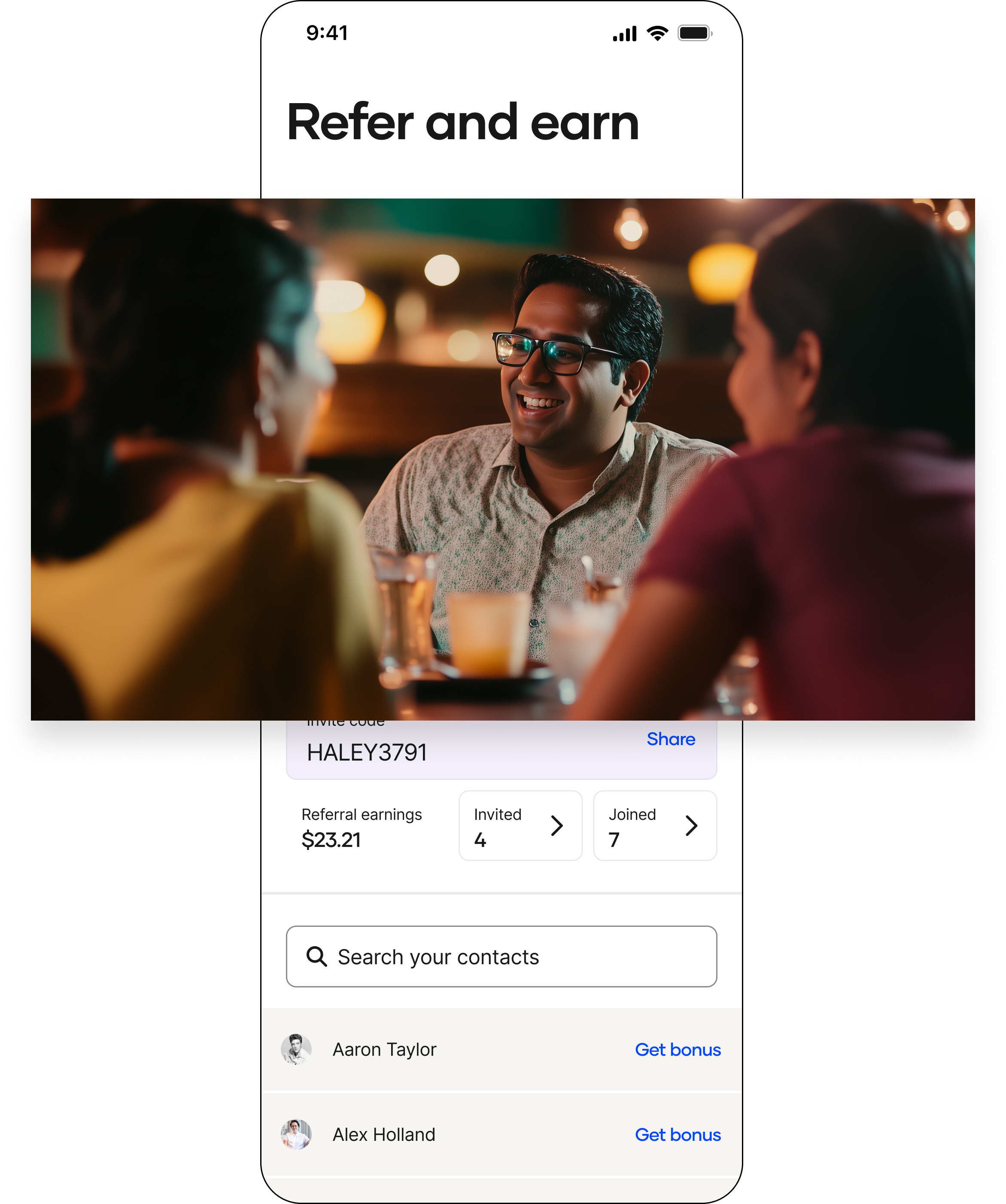
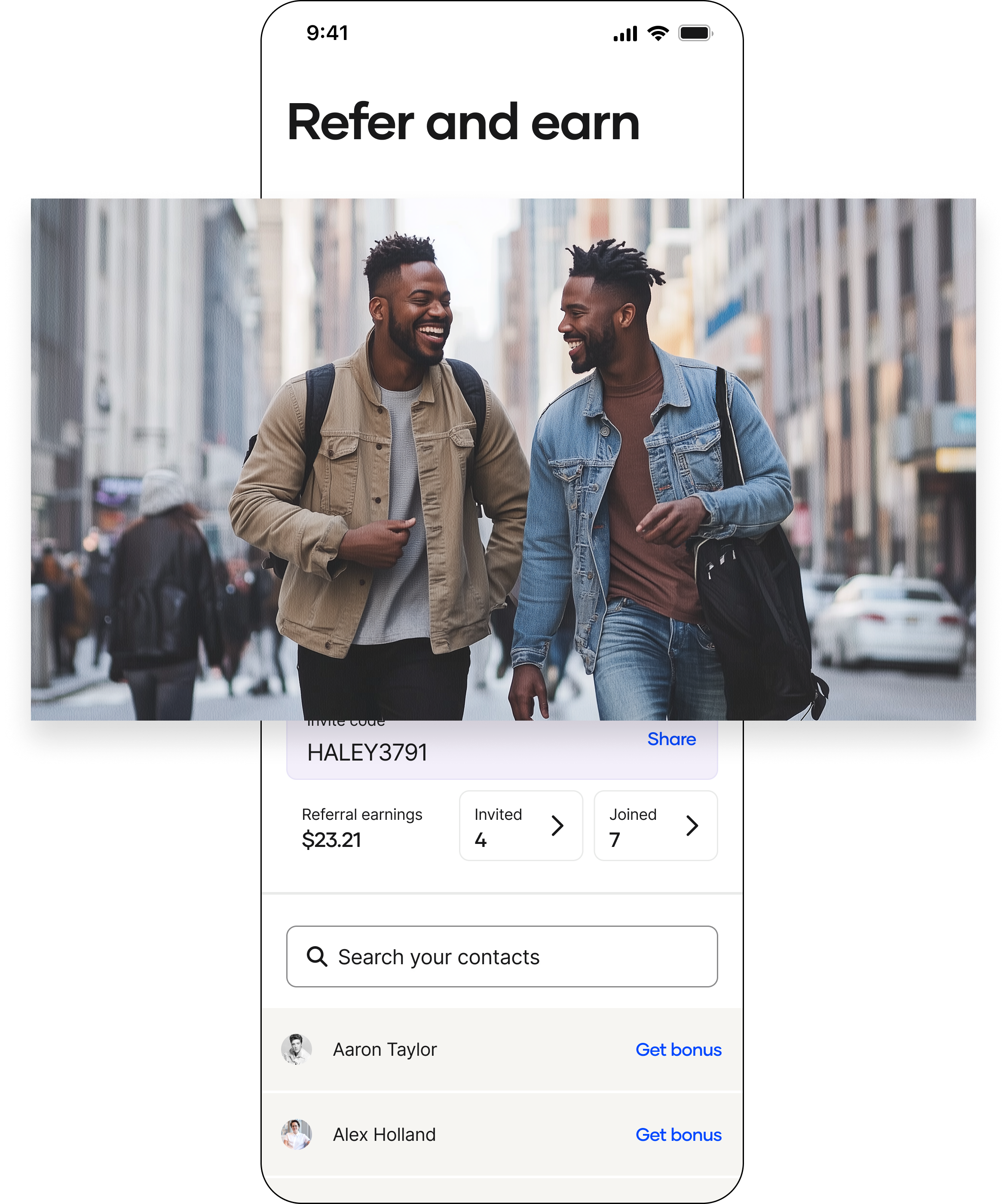
Because Upside had a major lack in photography, I explored different options for the hero image using Midjourney. I wanted to make sure we showed happy humans connecting with one another
The winner 🎉
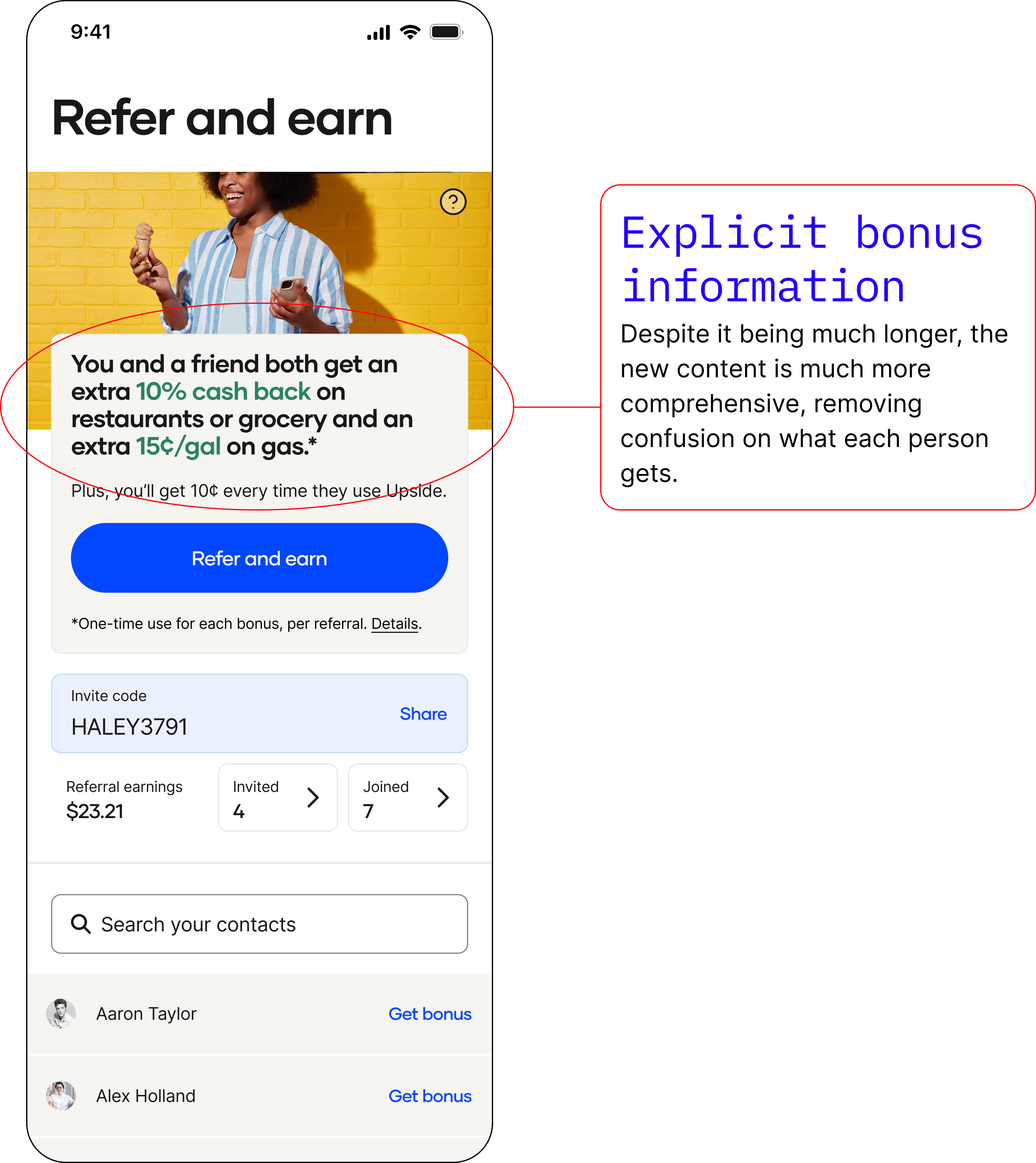
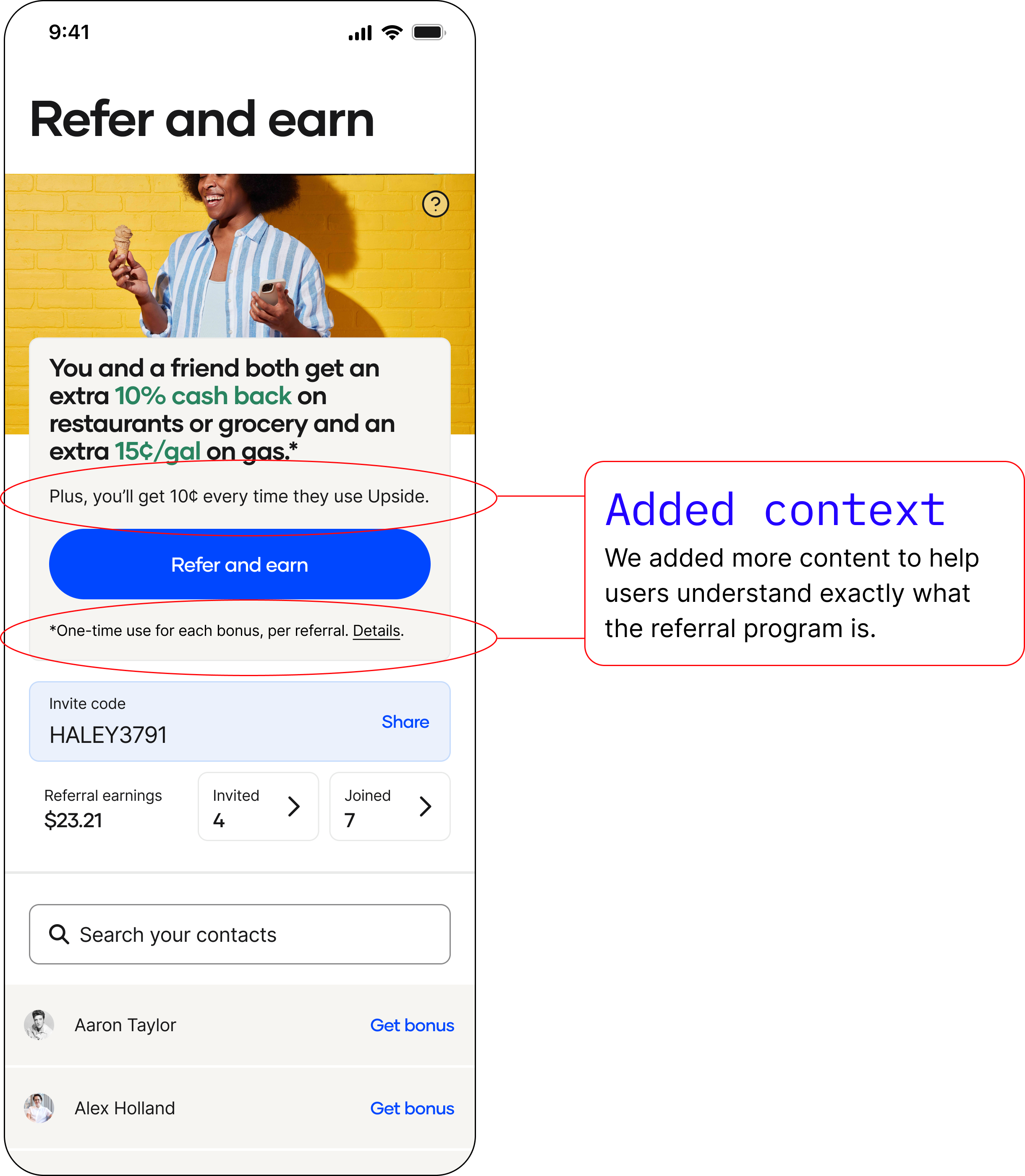
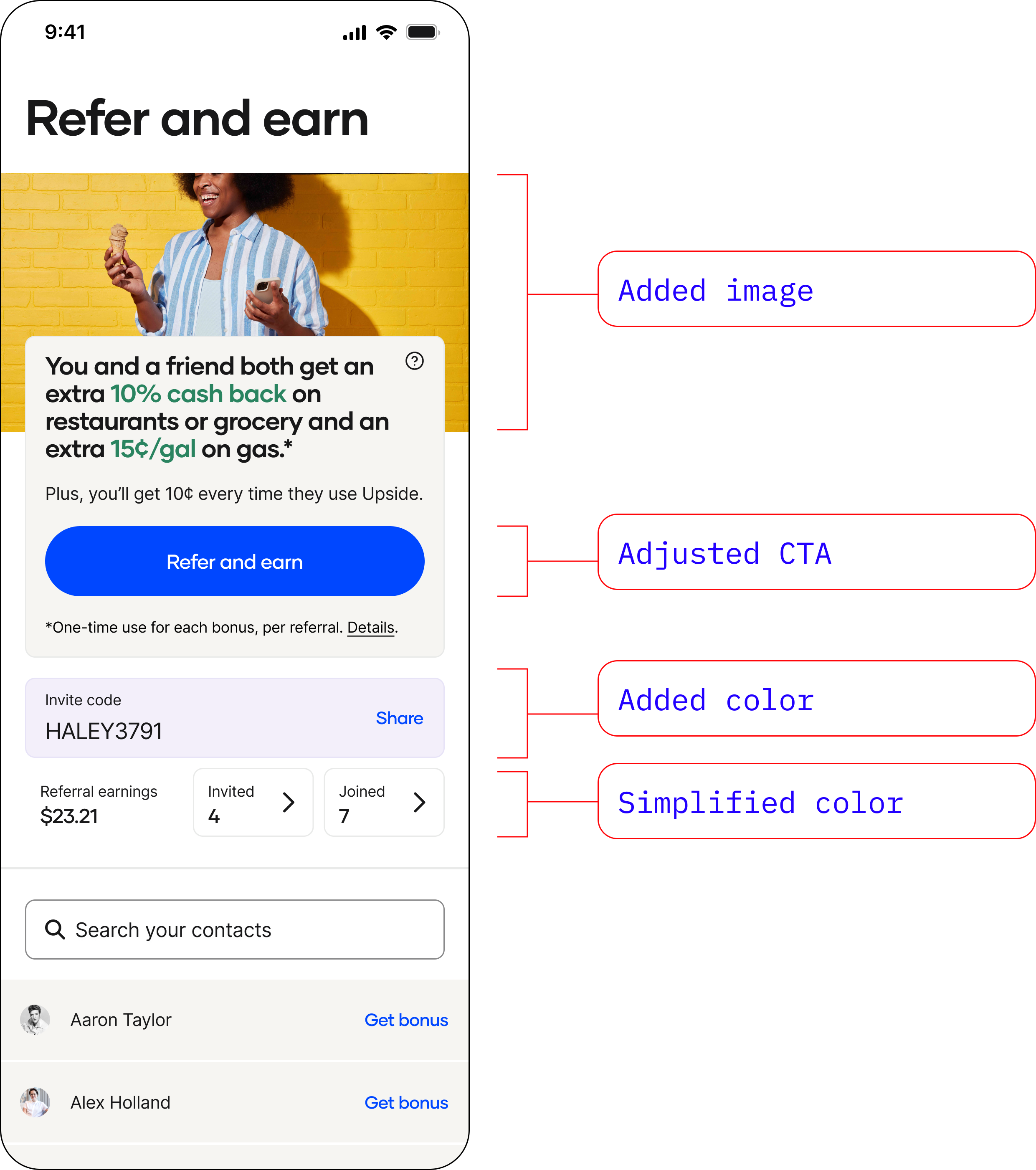
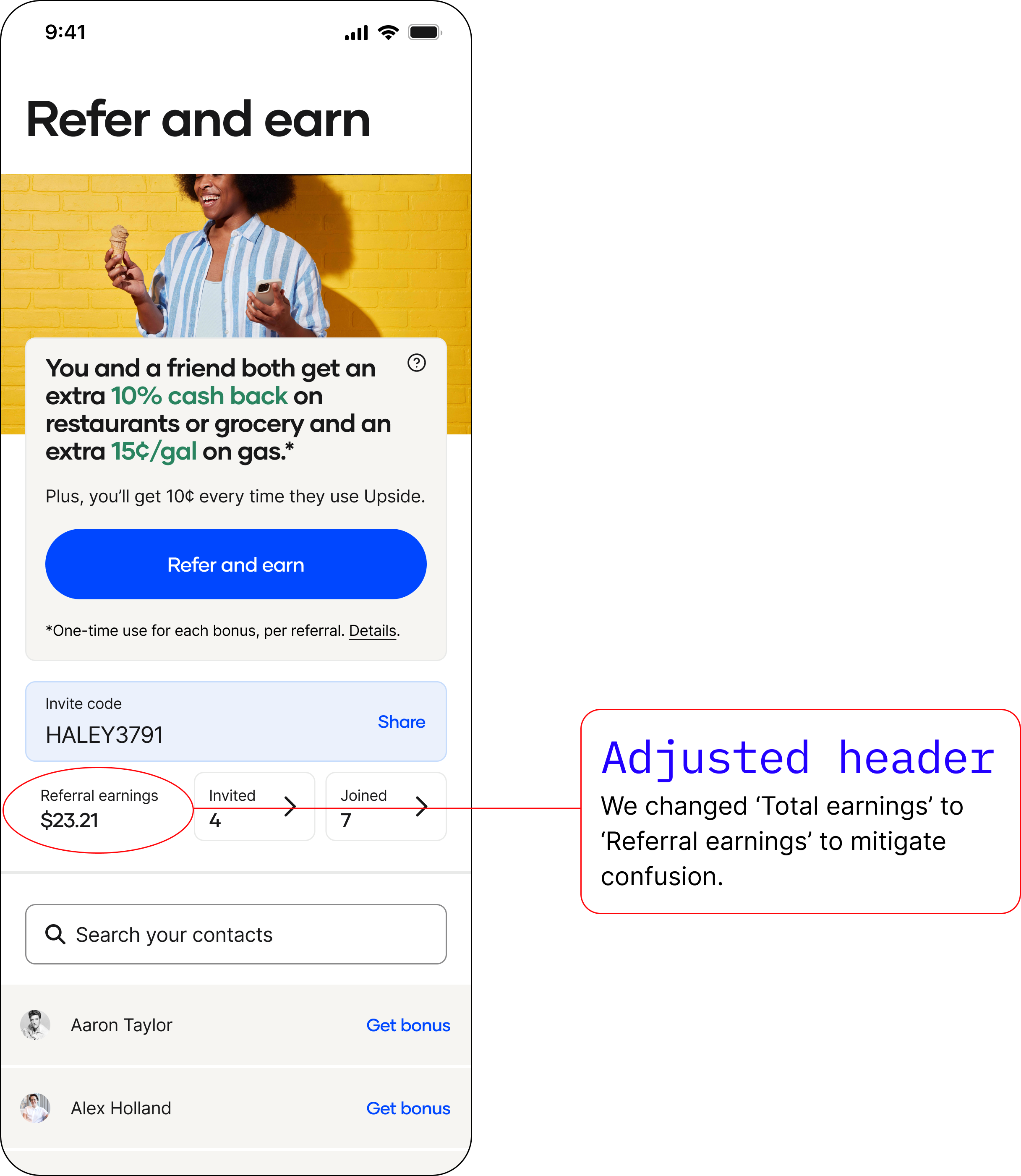
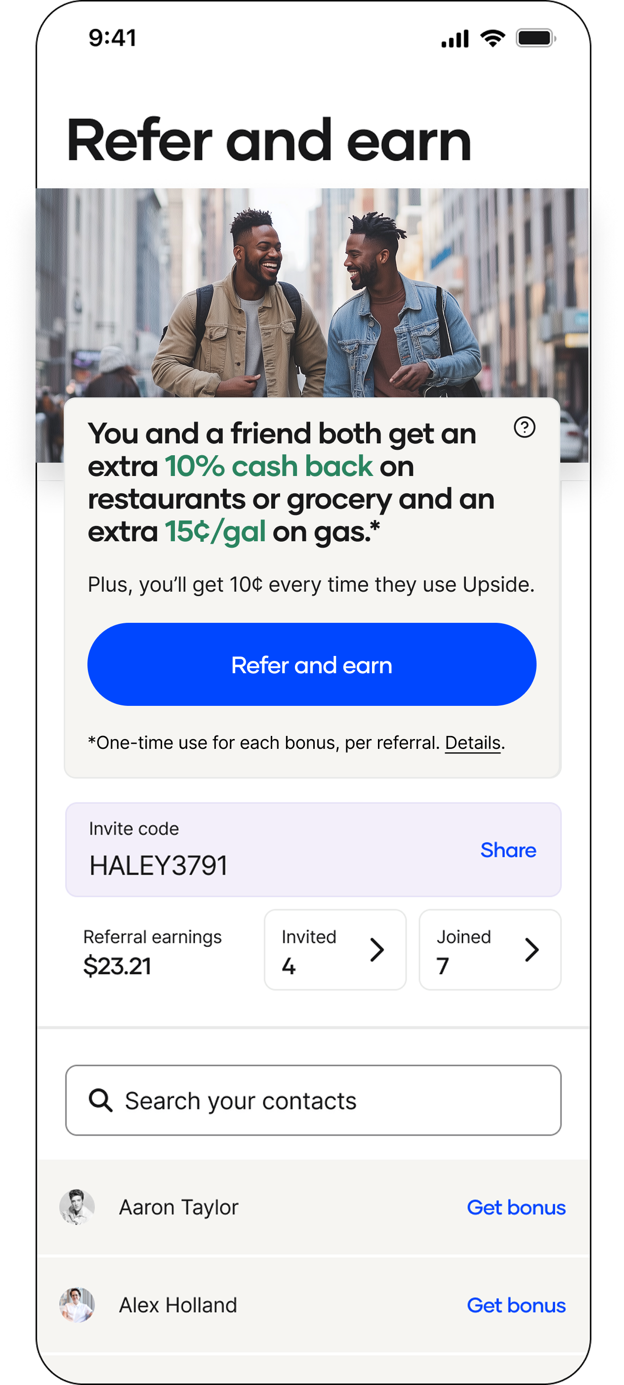
Before and afters
Let’s take a quick look at where we started and where we ended.
Before
After
But was there more we could do?
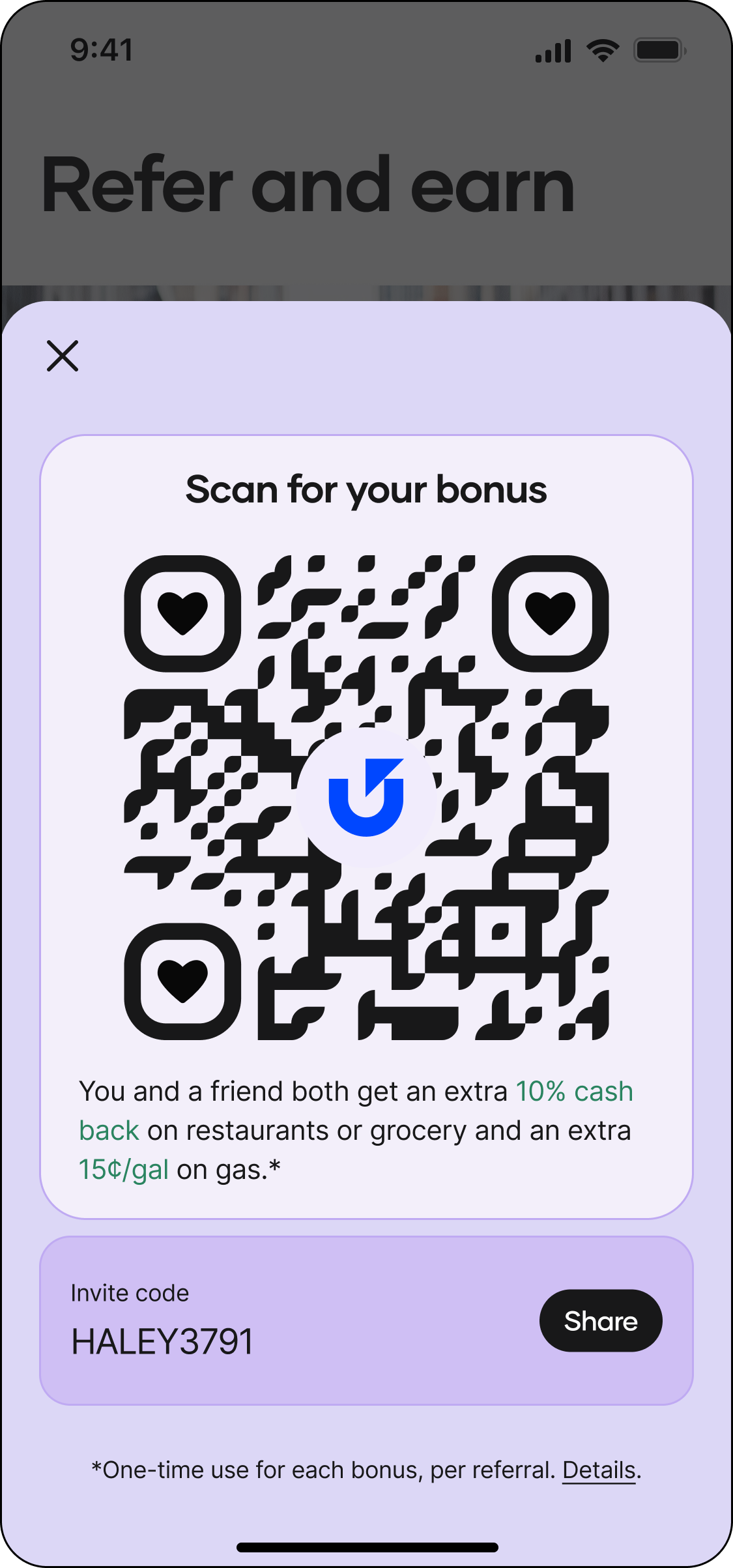
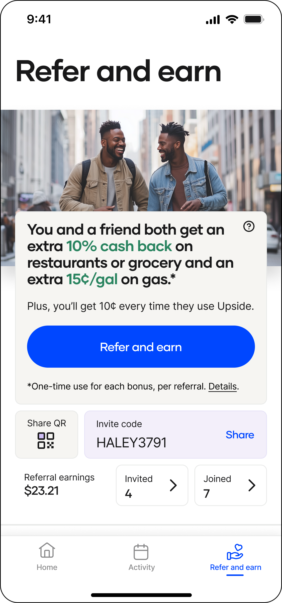
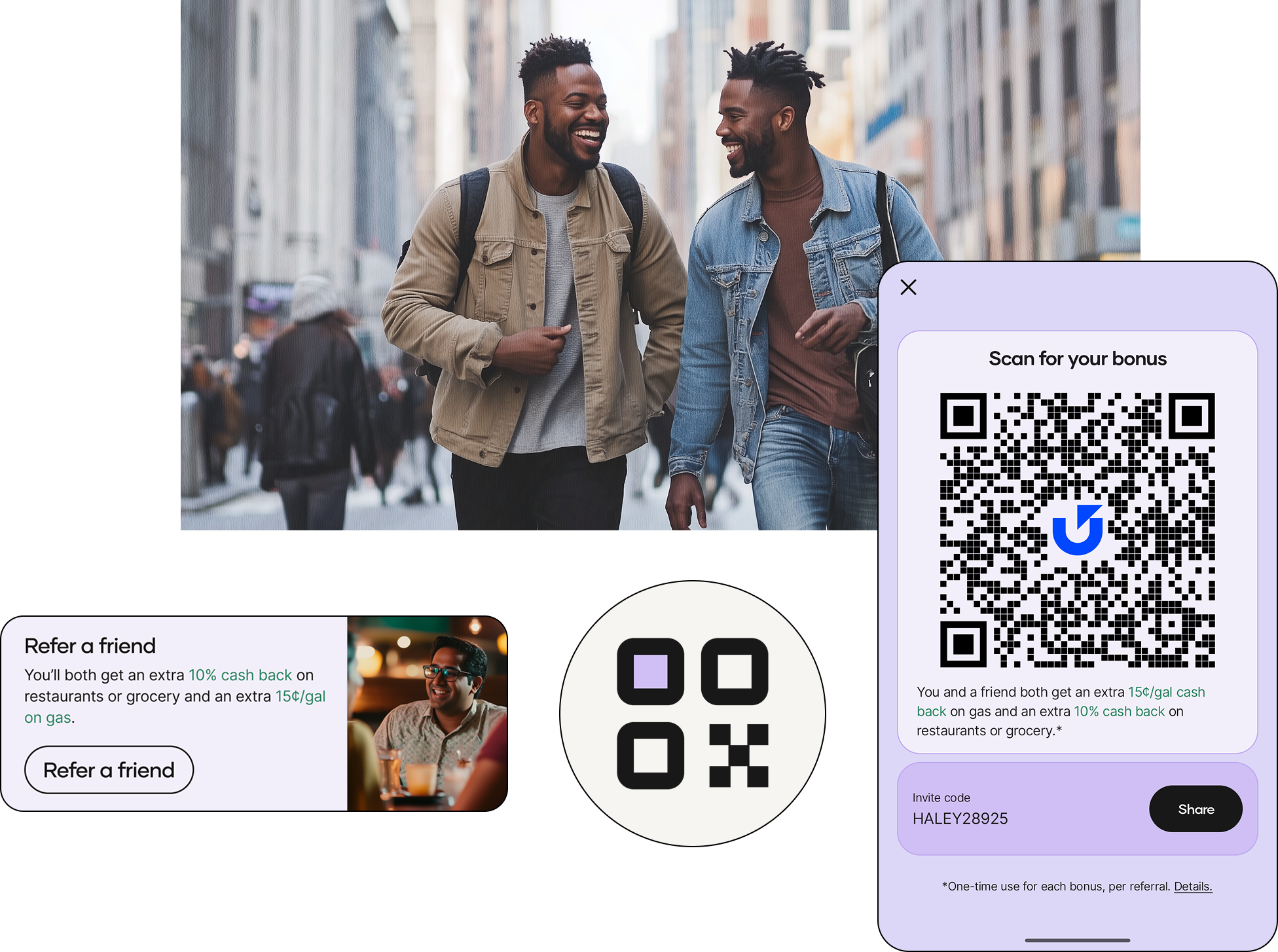
What if the user didn’t have the referee’s phone number? Could we make it so they could still refer them?
We added a QR code and pushed it to 5% of users to see how it performed.
QR code sheet
“Share QR” block added
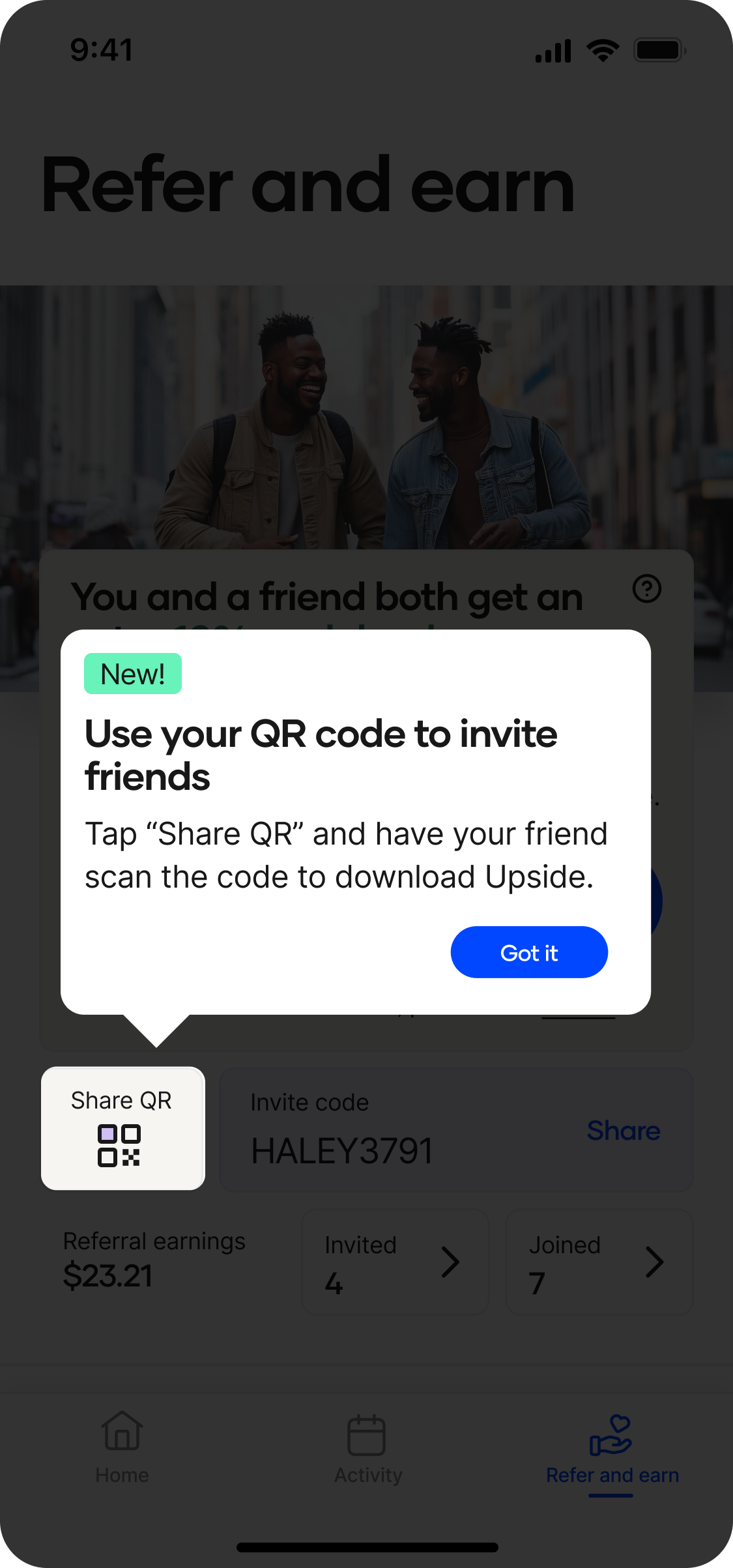
FTUX teaching moment
Over the next month, we saw a 2% increase in referral sign ups via the QR code 👏
Because of the good results, we launched to 100% of users.
During this project, I successfully pitched all referrals being branded with one of our core colors, Swell.
This brought more personality and recognition to the referral touchpoints throughout the app.

